design
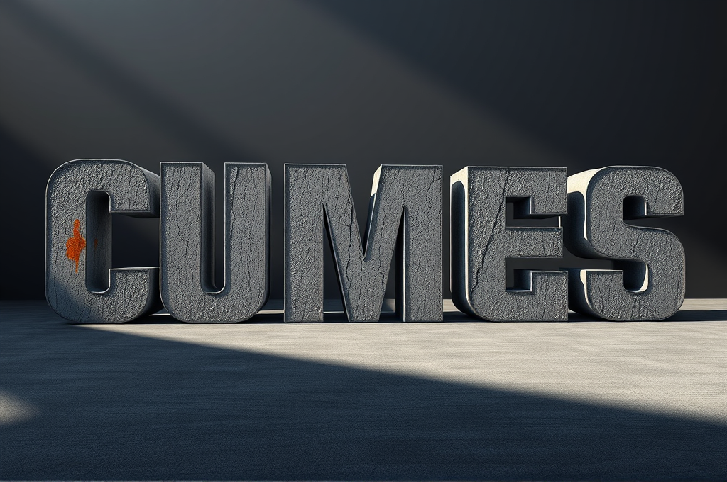
Brutalist Concrete 3D Typography Design Prompt for Leonardo
Graphic designers, brand studios, and creative directors use this prompt to generate striking hero visuals for album covers, event posters, fashion branding, and architectural firm identities. It delivers an intimidating, premium concrete aesthetic that reads as high-end and editorial. Motion designers also adapt the output as keyframes for title sequences. The restrained palette makes it easy to layer with real typography or logos in post.
Output Sample
The Prompt
Design a monumental brutalist typography composition rendered as massive 3D concrete letterforms. The word or phrase should be sculpted from raw, poured gray concrete with visible formwork texture, wooden plank imprints, aggregate speckles, and subtle hairline cracks that convey weight and permanence. Each letter emerges from a solid architectural slab, casting deep hard-edged shadows under dramatic directional lighting. Use an oversized, ultra-bold condensed sans-serif typeface inspired by mid-century brutalist architecture — think thick strokes, blunt terminals, and heavy geometric proportions. Place the letterforms within a minimalist environment: an empty concrete plaza or a matte charcoal studio backdrop with soft atmospheric haze. The lighting should be a single strong key light from the upper left at a low angle, creating long cinematic shadows and sculpting the rough surface relief, complemented by cool ambient fill to reveal texture in the shadows. Color palette restrained to cement gray, ash, bone white, and deep slate, with one optional accent of weathered rust-orange or oxidized teal staining the concrete for contrast. Emphasize tactile realism: moisture stains, efflorescence, chipped edges, exposed rebar hints, and a fine matte microtexture across every surface. Compose with strong negative space, centered or rule-of-thirds placement, and a slightly low camera angle to amplify scale and intimidation. Render in photorealistic quality with crisp focus, physically accurate materials, and subtle depth-of-field falloff in the background. Aspect ratio 4:5 or 1:1 for poster use, high dynamic range, 8K detail. Negative prompt: glossy plastic, cartoon, blurry text, warped letters, cluttered background, oversaturation, low resolution, soft mushy edges.
How to use
- Copy the prompt above using the copy button
- Replace any [bracketed placeholders] with your details
- Paste into leonardo
- Adjust and iterate based on the result
Shared by
Leila Ahmadi
Tehran-based graphic designer in exile creating typographic art with AI tools. Expression through prompts.
Works With
leonardo
Details
Categorydesign
AddedOct 7, 2026
Shared by
Leila Ahmadi
Tehran-based graphic designer in exile creating typographic art with AI tools. Expression through prompts.
Ready to use this?
Copy and paste directly into your AI tool.
Community Reviews
You might also like
Related to:#brutalist typography#concrete 3D text#poster design#architectural lettering#monumental type
Design
Risograph Layered Print Poster Design Prompt for Firefly
Indie designers, zine creators, event promoters, and small studios use this prompt to produce authentic risograph-style posters without owning a Riso printer. It delivers warm, tactile, limited-palette artwork perfect for gig posters, exhibition flyers, album covers, and merch. Marketers and brands adopt it for nostalgic, craft-forward campaigns that stand out from clean corporate visuals. The result is a print-ready design with genuine analog character.
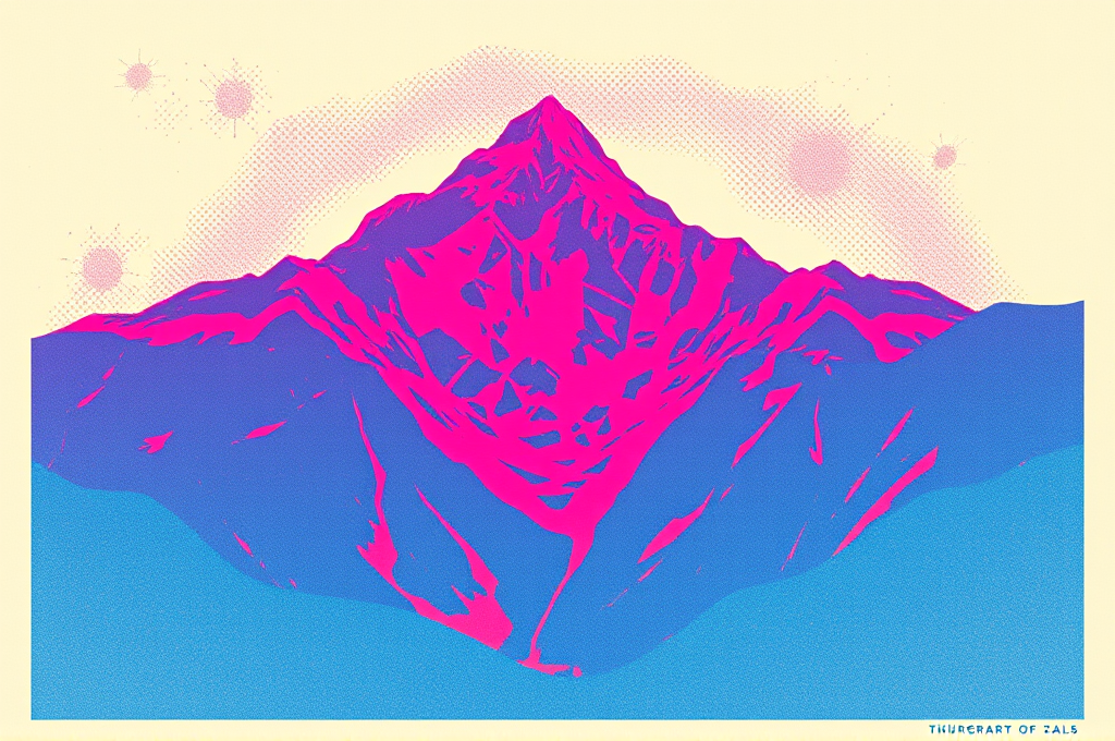
Create a retro risograph-style print poster design with the authentic handmade charm of a vintage duplicator machine. Render a bold, graphic composition featuring a stylized central subject (adjust to your theme — a mountain landscape, a human figure mid-motion, a houseplant, or abstract geometric shapes). Apply the signature risograph aesthetic: limited spot-color palette using classic Riso inks such as fluorescent pink, federal blue, sunflower yellow, and medium green, layered with visible transparent overlaps that produce rich multiply-blend secondary tones where colors intersect. Add deliberate misregistration so each color layer sits slightly offset by 2-4 pixels, creating a tactile, imperfect printed feel. Infuse the entire image with a coarse, visible halftone dot grain and subtle paper texture, as if printed on uncoated recycled cream stock. Keep the color separations flat and posterized with no smooth gradients — instead use stippled, dithered shading and bold negative space. Include chunky retro sans-serif or condensed grotesque typography integrated into the layout as a headline or event detail, printed in one of the overlay inks. Compose with a strong editorial hierarchy, generous margins, and a slightly off-center balance reminiscent of 1970s–80s indie publishing. The mood should feel nostalgic, analog, warm, and creative. Technical parameters: aspect ratio 2:3 (portrait poster), resolution 300 DPI print-ready, content type 'Art', style strength 85, visual intensity high, color palette limited to 3-4 Riso spot inks, texture emphasis on grain and halftone, reference strength medium. Avoid photorealism, smooth digital gradients, and glossy finishes. Output should look convincingly screen-printed and hand-pulled.
firefly
#risograph#poster design
Isabelle Dupont

Design
Risograph Overprint Poster Design Prompt for Stable Diffusion
Graphic designers, illustrators, and indie studios use this prompt to generate eye-catching poster concepts, album covers, event flyers, and zine spreads with an authentic analog print look. It saves hours of manual texture layering and misregistration effects that normally require Photoshop or a real riso machine. Marketers and small brands get trendy, tactile visuals that stand out from clean corporate design. The result is a handmade, boutique print aesthetic that feels premium and culturally on-trend.
Design a striking risograph-style print poster with authentic overprint aesthetics. Compose a bold, editorial layout featuring a central subject — a stylized human figure mid-stride carrying a large geometric shape — surrounded by abstract organic blobs, halftone dot gradients, and hand-drawn linework. Render it in a limited spot-color palette of fluorescent pink, teal, and marigold yellow, using multiplied overprint blending where colors overlap to create rich, unexpected secondary tones. Emphasize the signature risograph imperfections: visible ink misregistration with 2-4px layer offset, grainy paper texture, slight color banding, uneven ink coverage with lighter patches, and a soft matte finish on off-white recycled paper stock. Incorporate coarse halftone screens at roughly 45-degree angles for shading rather than smooth gradients. Add minimalist bold typography in a chunky grotesque sans-serif for a headline, with subtle roughened edges. Keep negative space generous and the layout asymmetric but balanced, following a strong grid. The overall mood should feel handmade, energetic, and analog — like a limited-run gig poster or art-book cover from a boutique print studio. Style keywords: risograph print, riso overprint, spot color, halftone texture, screen print aesthetic, indie zine, grainy ink, misregistration. Avoid photorealism, glossy finishes, and smooth digital gradients. Emphasize tactile, imperfect, print-based charm. Negative prompt: photorealistic, 3D render, smooth gradients, glossy, high detail skin, blurry, watermark, jpeg artifacts, perfectly aligned registration, drop shadows, gradient mesh. Recommended settings: Stable Diffusion XL, sampler DPM++ 2M Karras, steps 30-35, CFG scale 7, resolution 832x1216 (portrait poster), seed varied for layout diversity, optional LoRA for halftone or screenprint texture at 0.6 weight.
stable-diffusion
#risograph#poster design
Emma Laurent
Design
Risograph Retro Poster Design Prompt for Firefly
Graphic designers, indie brand studios, and marketing teams use this prompt to generate eye-catching event posters, album covers, and editorial layouts with authentic print texture. It delivers a distinctive handmade risograph look without needing a physical printer or expensive materials. Zine makers and social media designers get scroll-stopping visuals that feel analog and premium. The layout leaves clean space for adding custom headlines and campaign copy.
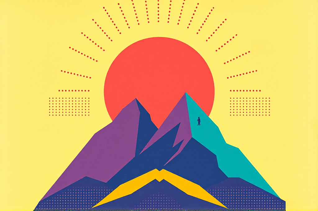
Create a bold retro-futuristic risograph-style poster design with the tactile charm of vintage print. The composition features a large central subject — a stylized geometric sun rising over an angular mountain range and a lone traveler silhouette — arranged with strong asymmetric balance and generous negative space. Render everything in the authentic aesthetic of a two-to-three color risograph print: overprinted spot inks, visible halftone dot patterns, slight misregistration where colors overlap creating unexpected third tones, and a soft grainy paper texture with subtle ink smudging at the edges. Use a limited palette of fluorescent pink, cobalt blue, and mustard yellow, letting overlaps produce muted purples and greens. Apply flat vector-like shapes with no gradients, only textured ink density variation to suggest depth. Include bold geometric sans-serif display typography for a placeholder headline area at the top, rendered as clean negative-space cutouts. Add fine linear elements, dotted grids, and retro starburst motifs to fill the background rhythm. The overall mood should feel handmade, nostalgic yet modern, evoking 1970s Japanese print culture fused with contemporary indie zine design. Emphasize crisp edges softened by print imperfection, high contrast between ink and unprinted paper, and a poster-ready vertical layout. Style: risograph print, screen-print texture, retro editorial, indie graphic design, flat illustration. Technical params — Aspect ratio: 2:3 (portrait poster), Resolution: 2048x3072, Content type: Art, Style strength: 85, Visual intensity: high, Color emphasis: fluorescent pink / cobalt blue / mustard yellow, Effects: grain heavy, halftone dots, ink misregistration. Avoid: photorealism, smooth gradients, 3D rendering, glossy surfaces, more than four colors, realistic lighting.
firefly
#risograph#poster design
Valentina Cruz
Design
Exploded View Technical Product Diagram Prompt for DALL-E
Product designers, marketing teams, and technical illustrators use this prompt to generate polished exploded-view visuals for pitch decks, spec sheets, crowdfunding pages, and e-commerce listings. It produces a professional engineering-catalog aesthetic without needing CAD software or a photographer. Startups showcasing hardware and educators explaining how devices work get clear, annotated component breakdowns in seconds. The result communicates craftsmanship and complexity while looking premium and trustworthy.
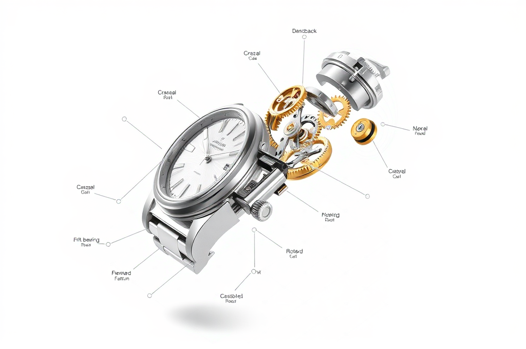
Create a hyper-detailed exploded-view technical diagram of a [PRODUCT — e.g. vintage mechanical wristwatch], with every internal and external component separated and suspended in mid-air along a single clean diagonal axis, as if disassembled and frozen in space. Arrange the parts in precise sequential order following the true assembly path, maintaining perfect alignment so the eye traces how each piece fits into the next. Render each component — the case, bezel, crystal, dial, gears, mainspring, rotor, crown, and caseback — with photoreal material accuracy: brushed stainless steel, polished brass gears, ruby jewel bearings, and matte engraved surfaces. Use thin dotted guide lines connecting each separated part back to its assembly position. Add slim leader lines and minimalist sans-serif annotation labels (part names and numbers) floating in clean margins, styled like a premium engineering blueprint or patent illustration. Lighting should be bright, even studio light with soft shadows beneath each floating part to reinforce depth. Background is a seamless off-white or pale blueprint-gradient surface with subtle grid lines. Composition should feel balanced, airy, and instantly readable, with generous negative space around the labels. Prioritize crisp edges, accurate proportions, and a sense of scientific precision blended with modern product-marketing polish. The overall aesthetic should look like a luxury catalog cutaway meets a technical patent drawing. Technical params: aspect ratio 3:2, ultra-high resolution, sharp focus edge-to-edge, isometric-leaning three-quarter camera angle, soft ambient occlusion shadows, neutral color grading, DALL-E 3 high-detail rendering, no motion blur, clean vector-like linework for callouts.
dall-e
#exploded view#technical diagram
Maya Chen