design
Isometric 3D Clay Icon Design Prompt for DALL-E
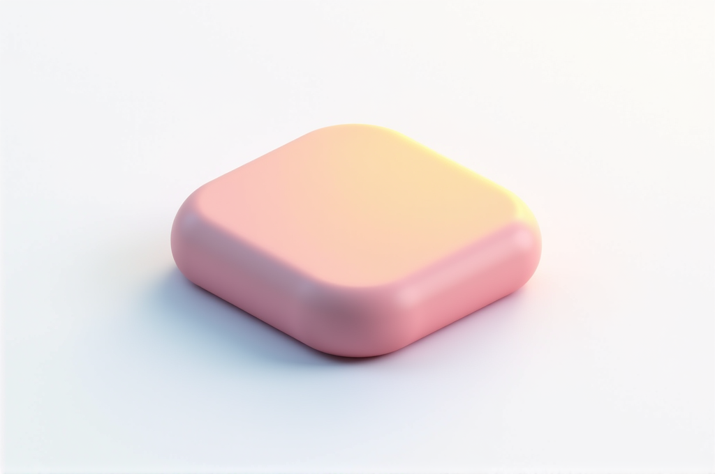
App developers, startup founders, and UI/UX designers use this to generate cohesive, premium-looking icon sets without hiring a 3D artist. The result is a polished claymorphic icon ready for app stores, onboarding screens, and design systems. Brand and social media designers also use it for eye-catching feature graphics. This beats a simple prompt because it locks in lighting, perspective, palette, and composition so every icon in a set looks consistent and professionally rendered.
Output Sample
The Prompt
Create a single hyper-minimalist 3D isometric icon rendered in a soft clay (claymorphism) style, centered on a clean solid background. Subject: a [REPLACE WITH YOUR OBJECT — e.g. a tiny shopping bag, a cloud-and-lock security symbol, a coffee cup, a wallet, a rocket]. Style: smooth matte clay material with gentle rounded edges, subtle surface imperfections, and a tactile handcrafted plasticine finish. Render it in true isometric perspective at a 30-degree angle, perfectly balanced and symmetrical within the frame. Lighting: soft diffused studio lighting from the upper left, producing gentle ambient occlusion in the crevices and a soft drop shadow beneath the object for a floating effect. Add a faint rim light to separate the icon from the background. Color palette: dreamy pastel gradients — blush pink, lavender, mint green, and powder blue — with a complementary muted background tone that makes the icon pop. Composition: object occupies roughly 60 percent of the frame, generous negative space around it, perfectly centered for use as an app icon or UI element. Mood: friendly, modern, premium, approachable, and clean. Camera angle: top-down isometric three-quarter view. Technical details: ultra high resolution, crisp clean edges, no text, no watermark, smooth gradient shading, soft global illumination, octane-render quality, product-photography clarity. Square 1:1 aspect ratio optimized for app stores and design systems. Keep the design extremely simple, avoid clutter, ensure a single clear focal subject, and maintain consistent lighting so the icon can be part of a cohesive icon set. Style references: claymorphism, neumorphism, soft 3D UI, Dribbble-trending icon packs.
How to use
- Copy the prompt above using the copy button
- Replace any [bracketed placeholders] with your details
- Paste into dall-e
- Adjust and iterate based on the result
Shared by
Priya Nair
Growth marketer obsessed with AI content systems. I've built full blog and social pipelines using Claude and ChatGPT. 3x startup experience, currently consulting for SaaS companies. Bangalore → Singapore.
Works With
dall-e
Details
Categorydesign
AddedJun 28, 2026
Shared by
Priya Nair
Growth marketer obsessed with AI content systems. I've built full blog and social pipelines using Claude and ChatGPT. 3x startup experience, currently consulting for SaaS companies. Bangalore → Singapore.
Ready to use this?
Copy and paste directly into your AI tool.
Community Reviews
You might also like
Design
Claymorphism 3D Typography Design Prompt for Leonardo
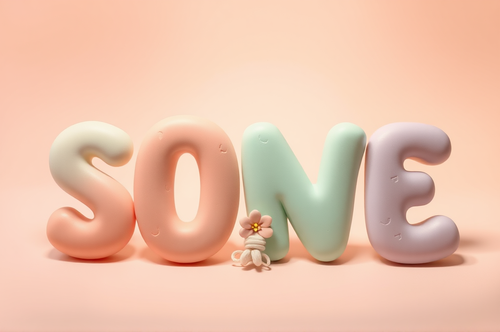
Brand designers, social media marketers, and packaging creators use this prompt to produce eye-catching playful typography for product launches, kids' brands, food packaging, and app onboarding screens. The result is a warm, tactile, premium clay-style word treatment that instantly feels approachable and modern. It works especially well for Instagram carousels, hero banners, and merchandise mockups. Studios can swap the word and color palette to fit any brand while keeping the trending claymorphism look.
Create a playful, premium claymorphism-style 3D typography design featuring the word 'BLOOM' rendered as soft, hand-molded clay letters. Each letter should appear sculpted from smooth matte plasticine with rounded, chubby edges, subtle fingerprint textures, and gentle surface imperfections that reveal the handmade origin. Use a pastel color palette of soft coral, buttery cream, mint green, and lavender, with each letter in a slightly different hue for a cheerful candy-like feel. Arrange the letters in a bold, centered composition with a shallow depth of field, letting the front letters stay crisp while the background softly blurs. Light the scene with a large, soft key light from the upper left and a gentle fill from the right, producing smooth wraparound shadows, subtle ambient occlusion in the crevices, and delicate soft-edged contact shadows beneath each letter. Add tiny decorative clay elements—rolled beads, small flowers, or a coiled squiggle—nestled around the letters to enhance the tactile handmade charm. The background should be a seamless pastel gradient studio backdrop (soft peach fading to warm white) that keeps focus on the typography. Emphasize a squishy, satisfying, toy-like material response with a matte non-reflective finish and high micro-detail. Style keywords: claymorphism, plasticine typography, soft 3D render, kawaii pastel, tactile clay, studio product photography, premium playful branding. Render in ultra-high resolution with photoreal clay materials, crisp macro detail on the front letters, and a warm inviting mood. Technical params: aspect ratio 4:5, Leonardo Phoenix or Diffusion XL model, PhotoReal enabled, Alchemy on, guidance scale 7, high contrast off, resolution 1024x1280, negative prompt: glossy plastic, harsh shadows, text errors, extra letters, low detail, blurry front subject.
leonardo
#claymorphism#3d typography
Liam Brennan
Design
Neo-Brutalist UI Design Prompt for Stable Diffusion Apps
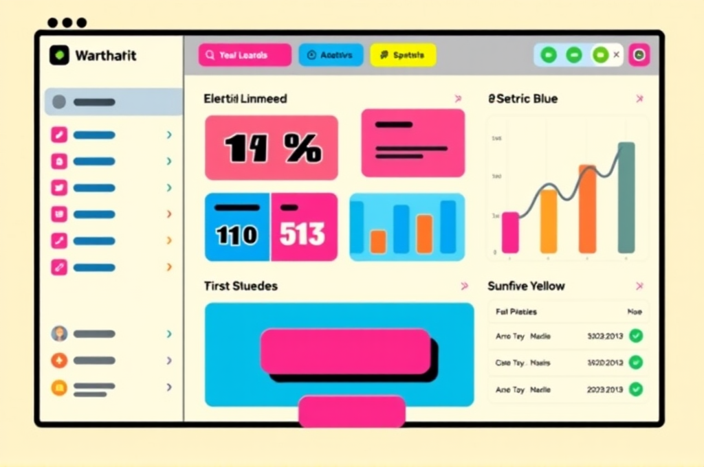
UI/UX designers, indie developers, and design agencies use this prompt to rapidly generate neo-brutalist interface mockups for pitches, moodboards, and landing pages. The result is a bold, trend-forward dashboard concept that stands out from generic minimalist designs. Startups building distinctive brand identities can prototype app screens in seconds. It's ideal for Dribbble portfolios, client presentations, and design inspiration boards.
A high-fidelity neo-brutalist user interface design mockup for a modern SaaS dashboard, showcasing bold and unapologetic visual language. Feature thick solid black borders (3-5px) around every element, hard-edged offset drop shadows (no blur, pure black, 6px offset), and raw flat color blocks in a vibrant retro palette: electric lime green, hot pink, cobalt blue, warm cream, and sunflower yellow. Include oversized chunky sans-serif typography with heavy weights, using fonts reminiscent of Archivo Black or Space Grotesk. Layout comprises a top navigation bar, sidebar menu with icon buttons, a main content area with stat cards, data tables, and rounded rectangular buttons with visible borders. Add subtle skeuomorphic touches like flat toggle switches and pill-shaped tags. The composition should feel structured yet playful, embracing intentional asymmetry and generous whitespace. Elements sit on a light cream or off-white background (#F5F1E8) to make the colored blocks pop. Include a call-to-action button in hot pink with black border and hard shadow. Design must look production-ready, clean vector illustration style, flat design with zero gradients, crisp geometric shapes, high contrast, sharp corners mixed with slightly rounded card edges. Perfect pixel alignment, balanced grid layout, modern web app aesthetic 2024. Negative prompt: gradients, soft shadows, blur, glassmorphism, photorealism, 3d render, cluttered, low contrast, muddy colors, watermark, text errors, distorted typography, realistic lighting. Technical params: Steps: 35, CFG scale: 7.5, Sampler: DPM++ 2M Karras, Resolution: 1344x768, Seed: random, Model: SDXL 1.0 or Juggernaut XL, Style preset: flat vector / digital art. Use hires fix at 1.5x upscale with 0.4 denoising for crisp edges.
stable-diffusion
#neo-brutalism#ui design
Rosa Bernardo
Design
Glassmorphism UI Design Prompt for Flux - Frosted Glass App Kit
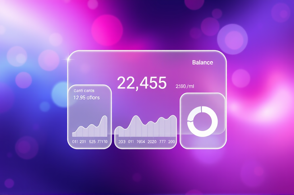
UI/UX designers, product designers, and startup founders use this prompt to generate polished glassmorphism interface concepts for pitch decks, portfolio pieces, and app store previews. Digital agencies leverage it to rapidly explore visual directions before committing to full production designs. The result is a premium, trend-forward mockup that communicates a modern, high-end product feel. It saves hours of manual layer styling in design software while sparking fresh creative inspiration.
Create a stunning modern glassmorphism user interface design showcasing a sleek mobile finance dashboard app. The composition features multiple layered frosted glass panels with semi-transparent surfaces, subtle backdrop blur, and delicate 1px white borders that catch light along their edges. Position a central card displaying account balance with crisp white sans-serif typography, surrounded by smaller floating widget cards for transactions, spending charts, and quick actions. Each glass panel should exhibit realistic depth with soft drop shadows, gentle inner highlights, and a translucent milky quality where the vibrant background bleeds through at reduced opacity. Set against a lush gradient backdrop transitioning from electric purple to deep indigo to soft magenta, with a few blurred colorful orbs floating behind the glass to enhance the frosted refraction effect. Include micro-details like rounded 24px corners, subtle noise texture on glass surfaces, minimal line-icon sets in white, and elegant data visualization elements such as a smooth donut chart and a gradient bar graph. Maintain generous negative space, precise grid alignment, and a clean visual hierarchy. Lighting should feel airy and premium, with cool ambient tones and delicate specular highlights along panel edges. The overall mood is futuristic, clean, and high-end, evoking a polished Apple-inspired design language. Render in ultra-high resolution with photorealistic material accuracy on the glass surfaces, crisp anti-aliased typography, and pixel-perfect UI spacing. Emphasize the interplay between transparency, blur, and vivid color for a contemporary, aspirational product-design aesthetic suitable for portfolios, app store showcases, and design inspiration boards. Style: modern UI/UX concept art, dribbble-quality, professional product mockup.
flux
#glassmorphism#ui design
Owen Blackwood
Design
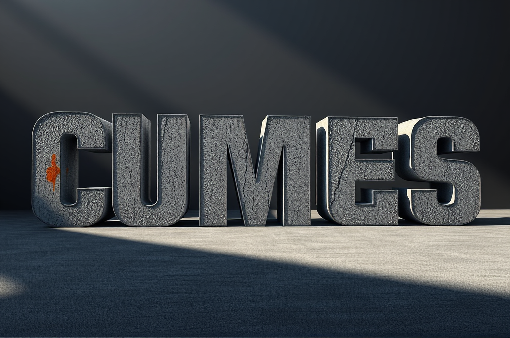
Brutalist Concrete 3D Typography Design Prompt for Leonardo
Graphic designers, brand studios, and creative directors use this prompt to generate striking hero visuals for album covers, event posters, fashion branding, and architectural firm identities. It delivers an intimidating, premium concrete aesthetic that reads as high-end and editorial. Motion designers also adapt the output as keyframes for title sequences. The restrained palette makes it easy to layer with real typography or logos in post.
Design a monumental brutalist typography composition rendered as massive 3D concrete letterforms. The word or phrase should be sculpted from raw, poured gray concrete with visible formwork texture, wooden plank imprints, aggregate speckles, and subtle hairline cracks that convey weight and permanence. Each letter emerges from a solid architectural slab, casting deep hard-edged shadows under dramatic directional lighting. Use an oversized, ultra-bold condensed sans-serif typeface inspired by mid-century brutalist architecture — think thick strokes, blunt terminals, and heavy geometric proportions. Place the letterforms within a minimalist environment: an empty concrete plaza or a matte charcoal studio backdrop with soft atmospheric haze. The lighting should be a single strong key light from the upper left at a low angle, creating long cinematic shadows and sculpting the rough surface relief, complemented by cool ambient fill to reveal texture in the shadows. Color palette restrained to cement gray, ash, bone white, and deep slate, with one optional accent of weathered rust-orange or oxidized teal staining the concrete for contrast. Emphasize tactile realism: moisture stains, efflorescence, chipped edges, exposed rebar hints, and a fine matte microtexture across every surface. Compose with strong negative space, centered or rule-of-thirds placement, and a slightly low camera angle to amplify scale and intimidation. Render in photorealistic quality with crisp focus, physically accurate materials, and subtle depth-of-field falloff in the background. Aspect ratio 4:5 or 1:1 for poster use, high dynamic range, 8K detail. Negative prompt: glossy plastic, cartoon, blurry text, warped letters, cluttered background, oversaturation, low resolution, soft mushy edges.
leonardo
#brutalist typography#concrete 3D text
Leila Ahmadi